19.3 Pie charts
A pie chart is a circle that is divided into sections, so that it looks like a pie or a pizza cut into slices. Pie charts also represent discrete (separate) data.
The whole pie chart represents the total amount of data. Each slice or sector represents a category of the data and the size of each sector shows the size of that category of the data.
The size of a sector is often given as a percentage.
A pie chart can make it easier to compare the categories of a set of data. But, pie charts can become hard to read if there are too many categories and the sectors become too narrow.
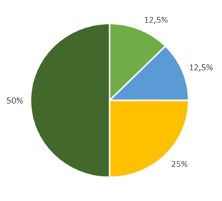
We can use any round object to draw the circle for a pie chart, and then divide the circle into sectors as accurately as possible. To make drawing pie charts easier, it helps to divide the circle into halves, quarters and eighths so that we get divisions of \(50\%\), \(25\%\) and \(\text{12,5}\%\).
We know that the sum of angles around a point is \(360°\), so the angle at the centre of the circle is \(360°\).
- When we split a circle into two halves, we divide the angles at the centre of the circle into two straight angles, so that \(2 \times 180° = 360°\).
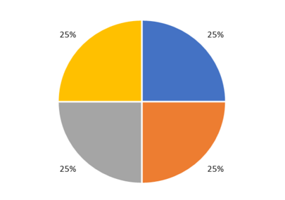
- When we split a circle into four quarters, we divide the angles at the centre of the circle into four right angles, so that \(4 \times 90° = 360°\).


Worked Example 19.4: Drawing a pie chart from a table of values
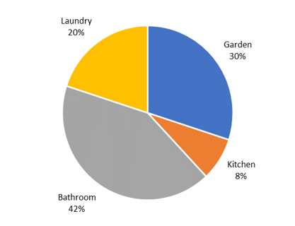
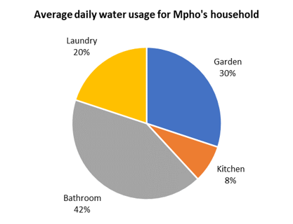
The table below shows the average daily water usage for Mpho’s household.
| Garden | \(30\%\) |
| Bathroom | \(42\%\) |
| Laundry | \(20\%\) |
| Kitchen | \(8\%\) |
- Use the table to draw a pie chart.
- Mpho’s household uses, on average, \(450\) litres of water per day. How many litres are used for laundry?
- How many litres are used for the garden?
Draw a circle and divide it into quarters.
Use any round object, like a mug or a cardboard tube, that is a suitable size to draw a circle for the pie chart. Mark the centre of the circle and divide the circle into quarters (four equal parts).
Adjust each quarter to the approximate proportion for each category.
Look at the values given in the table.
We notice that the percentages for the garden category + laundry category \(= 30\% + 20\% = 50\%\).
So we can adjust two of the quarters so that the garden category represents approximately \(30\%\) and the laundry category approximately \(20\%\).

The percentages for the kitchen category + the bathroom category \(= 8\% + 42\% = 50\%\).
We know that one eighth (half a quarter) of the circle is \(\text{12,5}\%\), we can use this fact to estimate \(8\%\) for the kitchen category and the remaining sector will represent \(42\%\) for the bathroom category.
Add a title to the pie chart and check data values.
Write an appropriate title for the chart and check that the values in the chart correspond with the values given in the table. In this case, we have included the category in the data label so the chart does not need a key.
Calculate the number of litres per day for laundry and the garden.
Mpho’s household uses \(450\) litres of water per day and \(20\%\) is used for laundry:
\[450 \times 20\% = 450 \times \frac{20}{100} = 90 \text{ litres}\]We can perform a similar calculation to find the number of litres used for the garden:
\[450 \times 30\% = 450 \times \frac{30}{100} = 135 \text{ litres}\]